Rebrand: Corvias Property Management
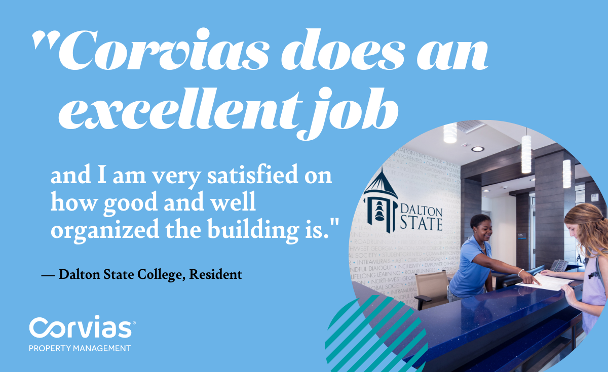
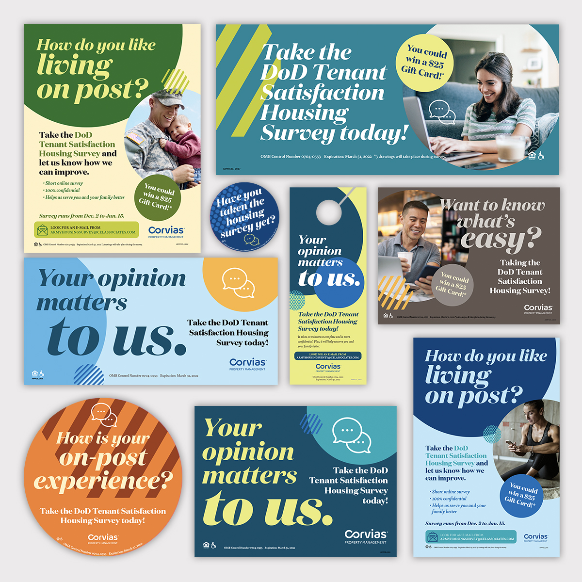
/Challenge: When Corvias Property Management became a standalone division, we realized it needed a friendlier B2C brand that stood apart from the Corvias corporate brand. At the same time, this brand needed to be easy to use for untrained designers due to recent reorg.
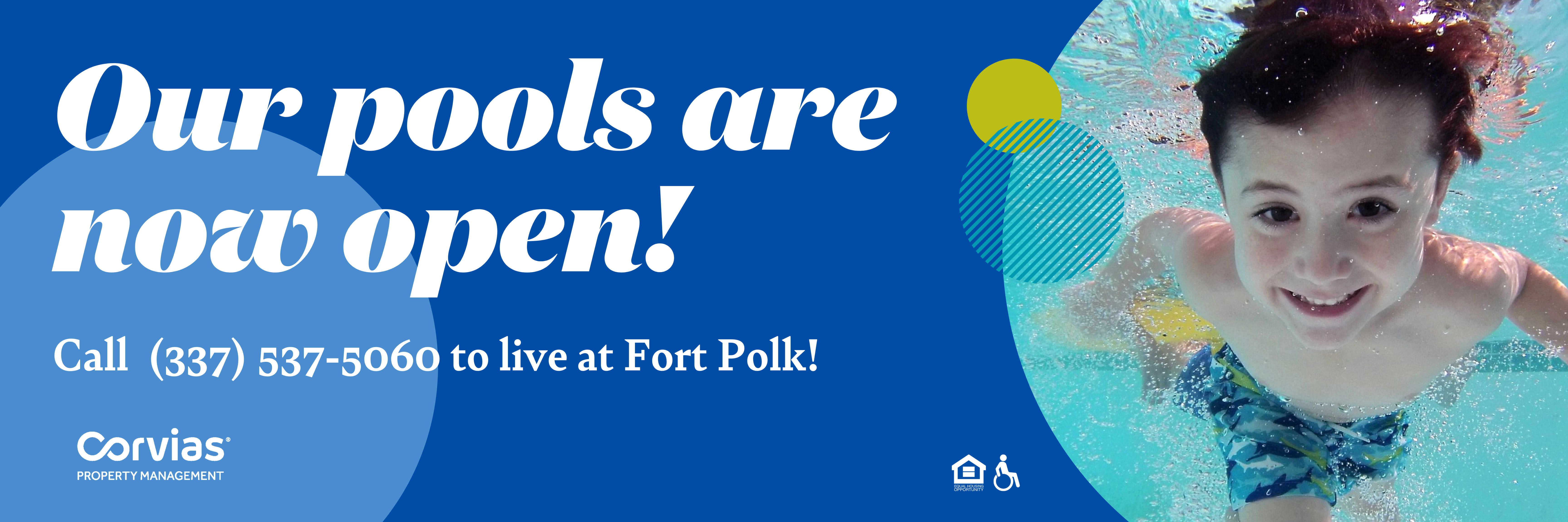
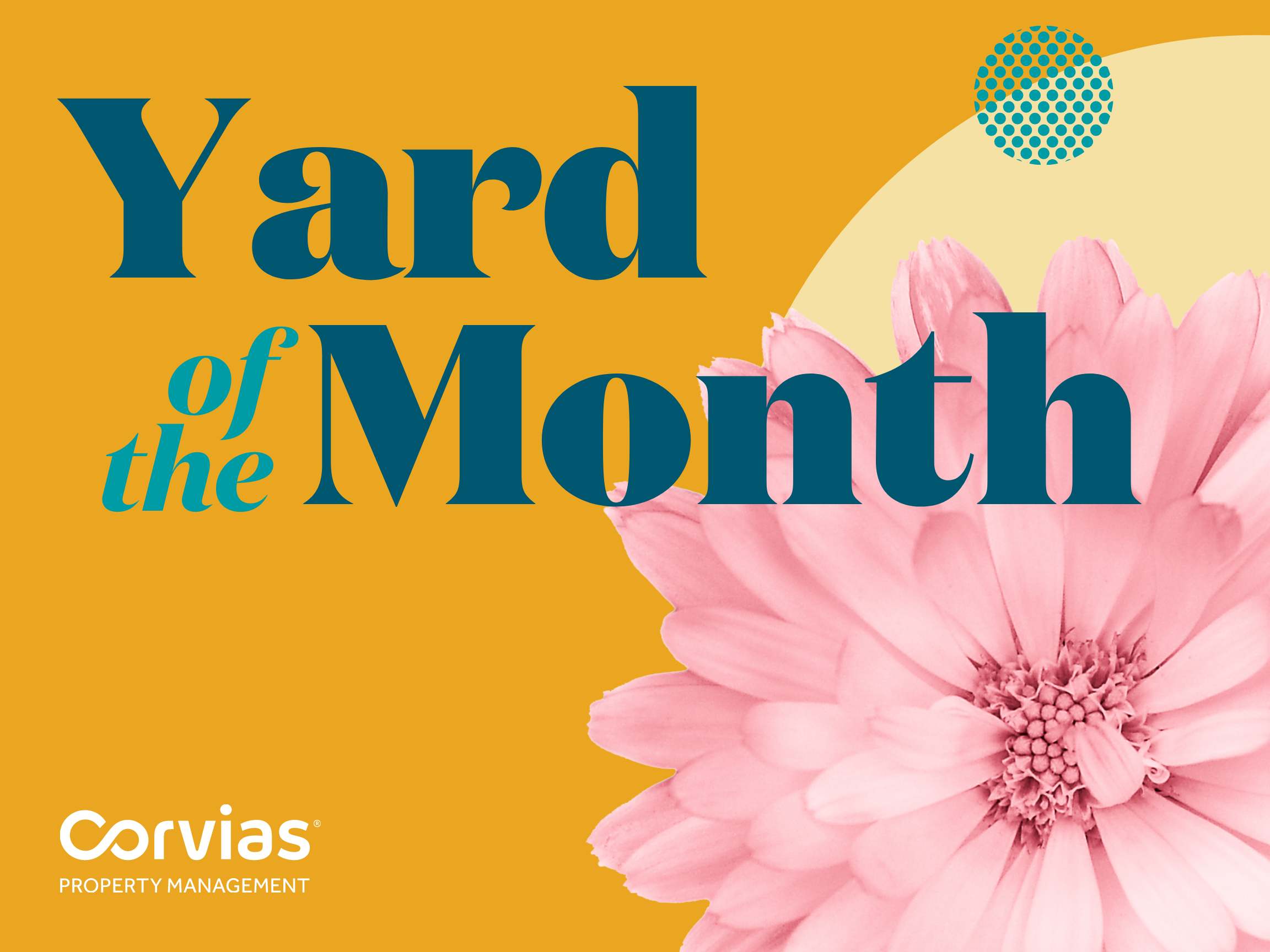
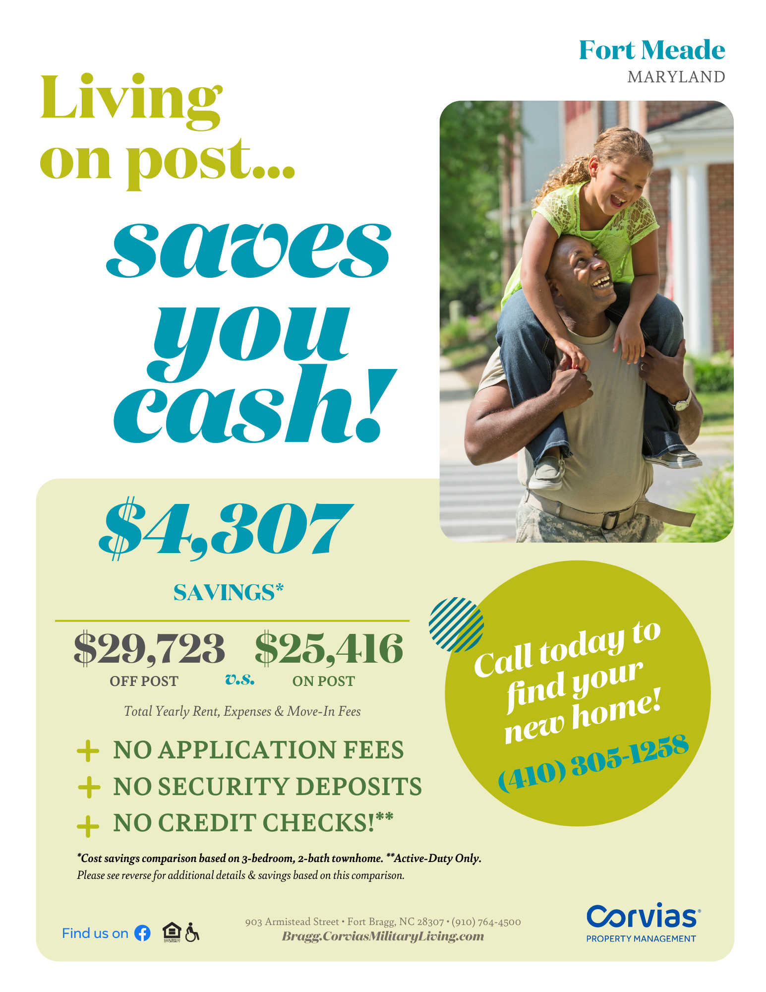
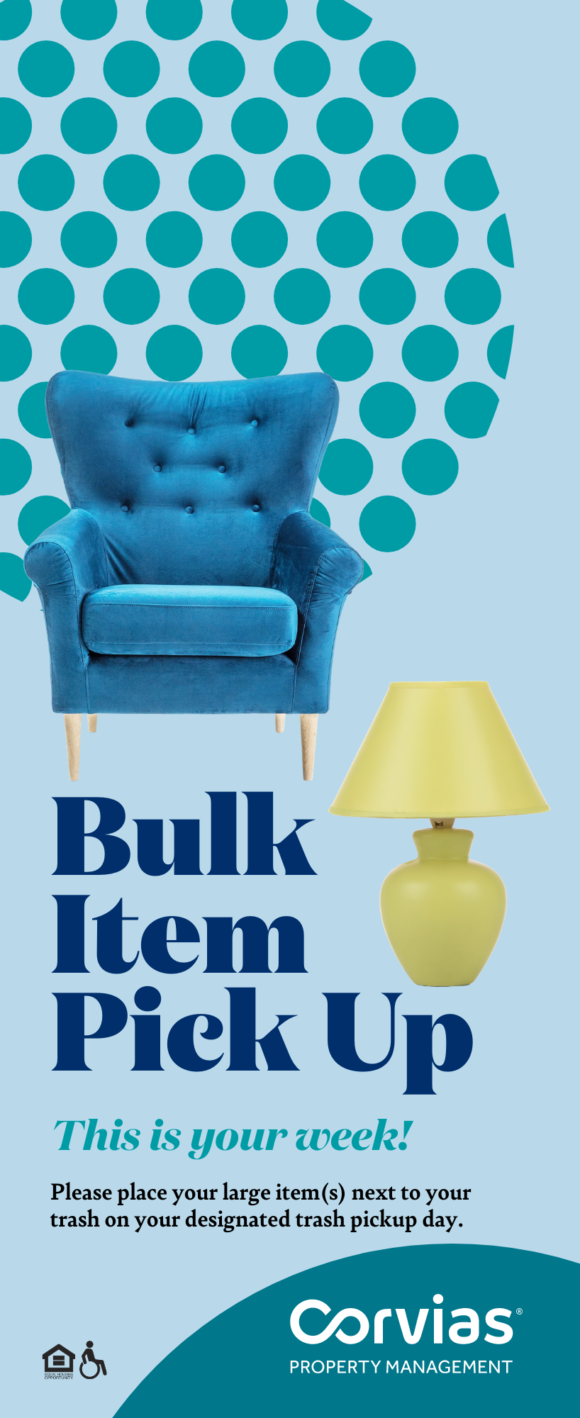
/Solution: Using the brand colors as a strating point, we created an additional palette to enhance it. At the same time chose a more organic bolder typeface for headlines and a serif typeface for the body copy. A series of ‘design elements’ help separate the materials from anything else residents see at our installations. Additionally, we created templates on the online tool Canva, so each local team can create their own marketing materials.
• Art Direction
• Design
//Collateral

//Resident Survey Campaign
Blue Cross BlueValueDirect Campaign
/Challenge: Attract a new group of customers to purchase health plans, young & single.
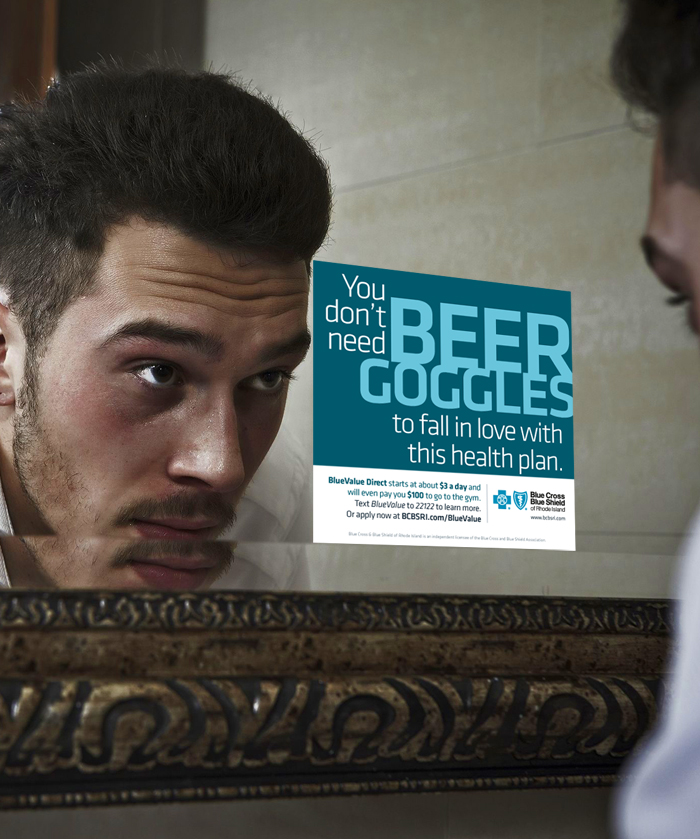
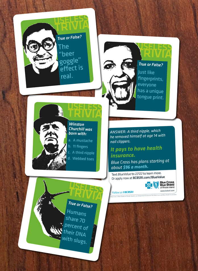
/Solution: An unorthodox advertising campaign strategically placed in media to target our core audience. Web banners, billboards, Ads, beer coasters.
• Art Direction
• Design
• Copy
//Mirror Clings at Bathroom Bars
//Billboards


//Beer Coasters
//Print Advertising (The Phoenix)
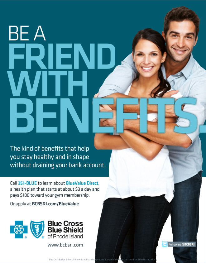

//Digital Ads
//Digital Display Ads at Fitness Centers 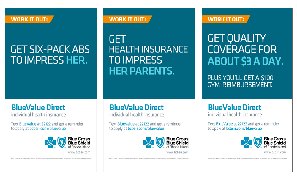
Cargo Collective 2017 — Frogtown, Los Angeles